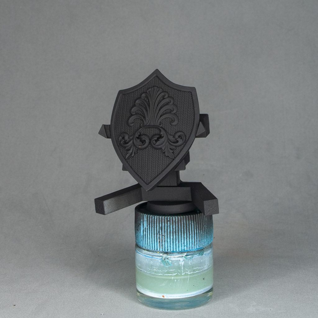
Let’s start priming with black. I used Scale 75 black primer.
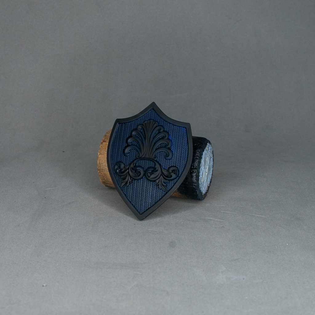
I started basecoating the fabric with a very dark blue. I used Dark Prussian Blue from Vallejo. Don’t worry about staining the other elements with blue as they will get even more stained later.

Start adding patches of clearer blues in more or less random patterns, trying to get good coverage on the raised areas. The idea here is giving irregular brushstrokes with the brush to simulate the fabric. What I did is placed the brush parallel to the surface with a low loaded brush, like in a drybrush but without rubbing it around to keep control and keep the paintjob clean. Pic about this below.
Alternatively you could drybrush the whole area but you won’t get so much texture and everything would look more blurry.
I started with Prussian Blue from Vallejo adding small quantities of white.
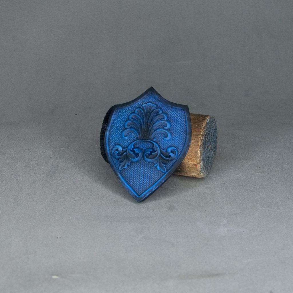
Add more white on the mix, also adding a little bit of Blue Green from Vallejo. We add the Blue Green to keep some saturation, as adding pure white only would lead to a very greyed result.
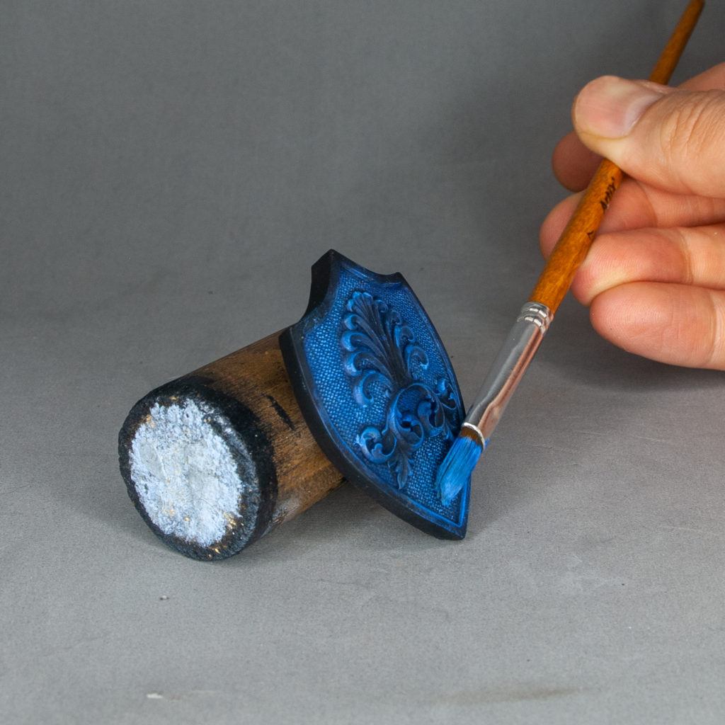
This is more or less the angle I used to do this. Similarly to using the drybrush technique, use fast and hard brushtrokes to create texture on the fabric.

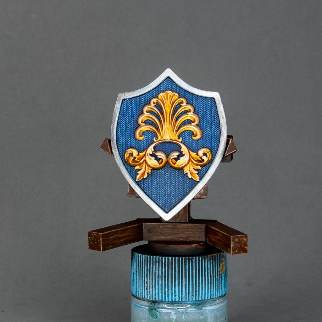
For the gold I basecoated with Dwarven Gold from Scale 75. If the metals were very stained with blue you can coat them with black, but if you are using metallics with good coverage it’s not needed.
I repainted the steel outline with black, as steely colors cover worse than golden.
After painting the steel area with black, I painted it with Heavy Metal from Scale 75.
I start adding small quantities of Heavy Metal to Dwarven Gold to get highlights on the golden areas. I started placing the lights on the areas facing upward.

Keep adding more Heavy Metal until you are happy with the result. I stopped at this point and I was using almost pure Heavy Metal for the brightest reflections.
In the steel part I used Silver from Vallejo to place a maximum highlight on the top of the shield and edge highlighted with Sky Grey from Vallejo.
For the leather straps I used a basecoat of Rhinox Hide from Citadel with a little bit of red and a little bit of black.

I start randomly wetblending with little control, using the basecoat mix (see previous step) and adding Ochre Brown from Vallejo and tiny quantities of Orange Red from Vallejo to keep saturation. Being random and making patches of paint, letting it do random things is what you want. The more texture and noise, the better.
With the same Ochre Brown and Sunny Skintone, I edge highlighted the leather straps trying to not be very precise. Some tremble in the brushtrokes is desired in order to get a worn look.
For the scratches and cuts, just draw the scrach with the same mix, and if you want to simulate a deeper one, place a very thin line of very dark brown or black on the interior.
Add little dots of Scale 75 Heavy Metal for the rivets.
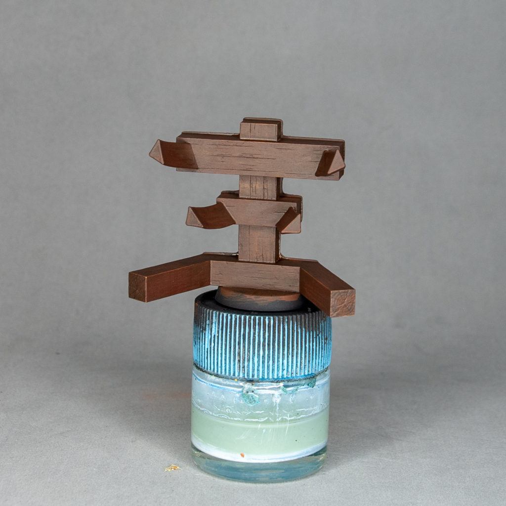
For the stand I start with a mix of Chocolate Brown from Vallejo, Red Ink from Scale 75 and Orange Red from Vallejo. The red and the ink are to vary the tone and keep saturation.
Im going for an older wood look for this stand to contrast with the shiny shield.
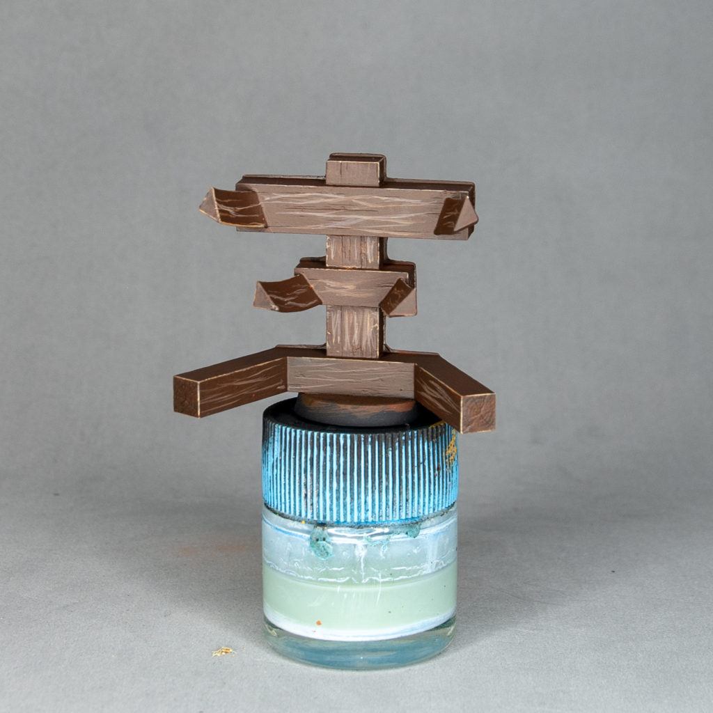
I add Ochre Brown to the mix and start drawing thin lines with a fine brush. Do it following the sculpt of the wood. Start placing some edge higlights with the same colors.
Alternatively, this could be done just by washing/drybrushing but the result would be much more blurry.

Painting more lines, adding Sunny Skintone to them. As in the leather straps, some erratic placement of more edge highlights will help the worn wood look.
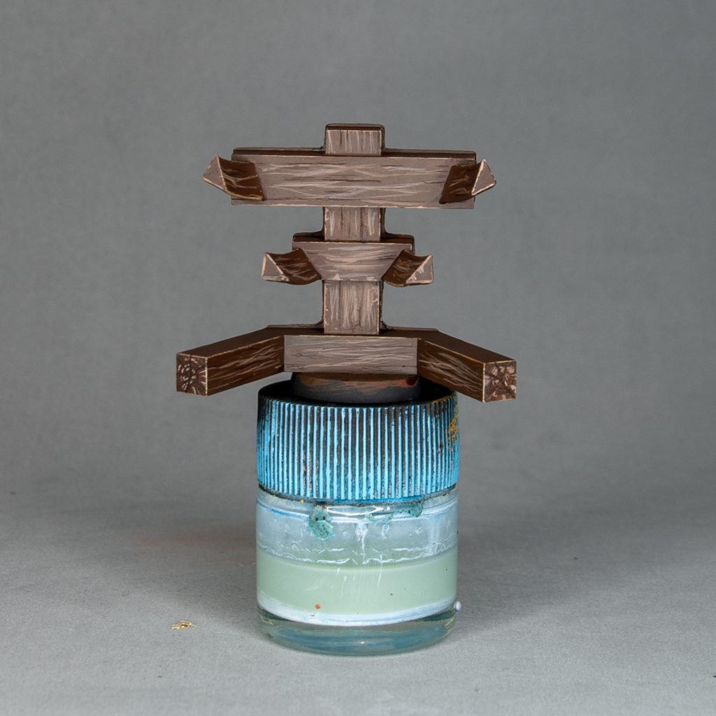
With a mix of red ink and black ink I start placing thin lines on the already sculpted creases of the wood. You can also fake some more running around the surface.
Don’t worry if at this point it looks desaturated and grey, we will be fixing that straight away.
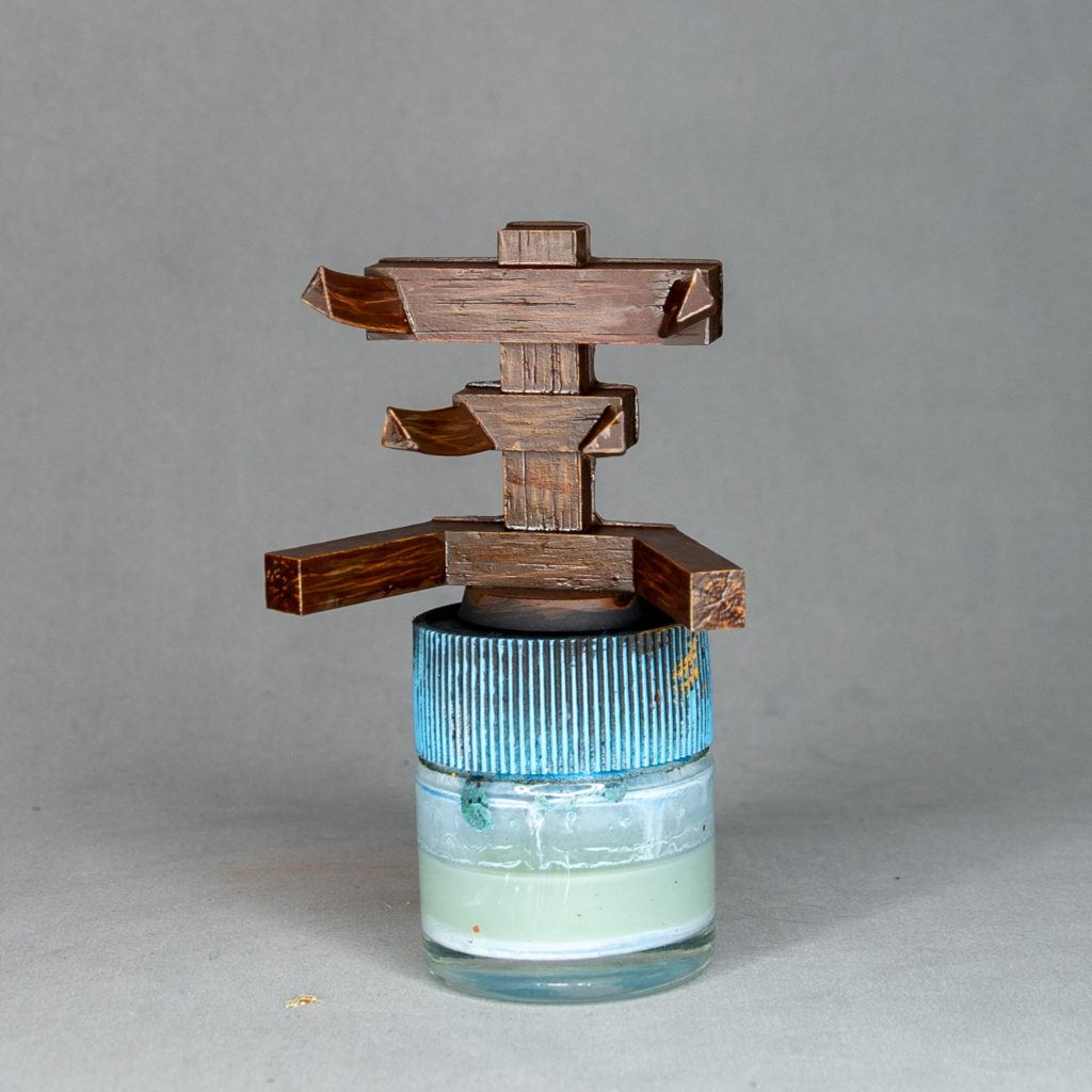
Now it’s time to get saturation back and achieve a more wooden feel. With Red, Wood and very small quantities of Green inks from Scale 75, I started patching randomly around the surface. Careful with the pooling of these inks because they leave nasty stains. The best thing here is to be random and leave different colors on different areas to keep the tones varied.
It will be shiny when dried due to the nature of inks, but we will fix that later on.
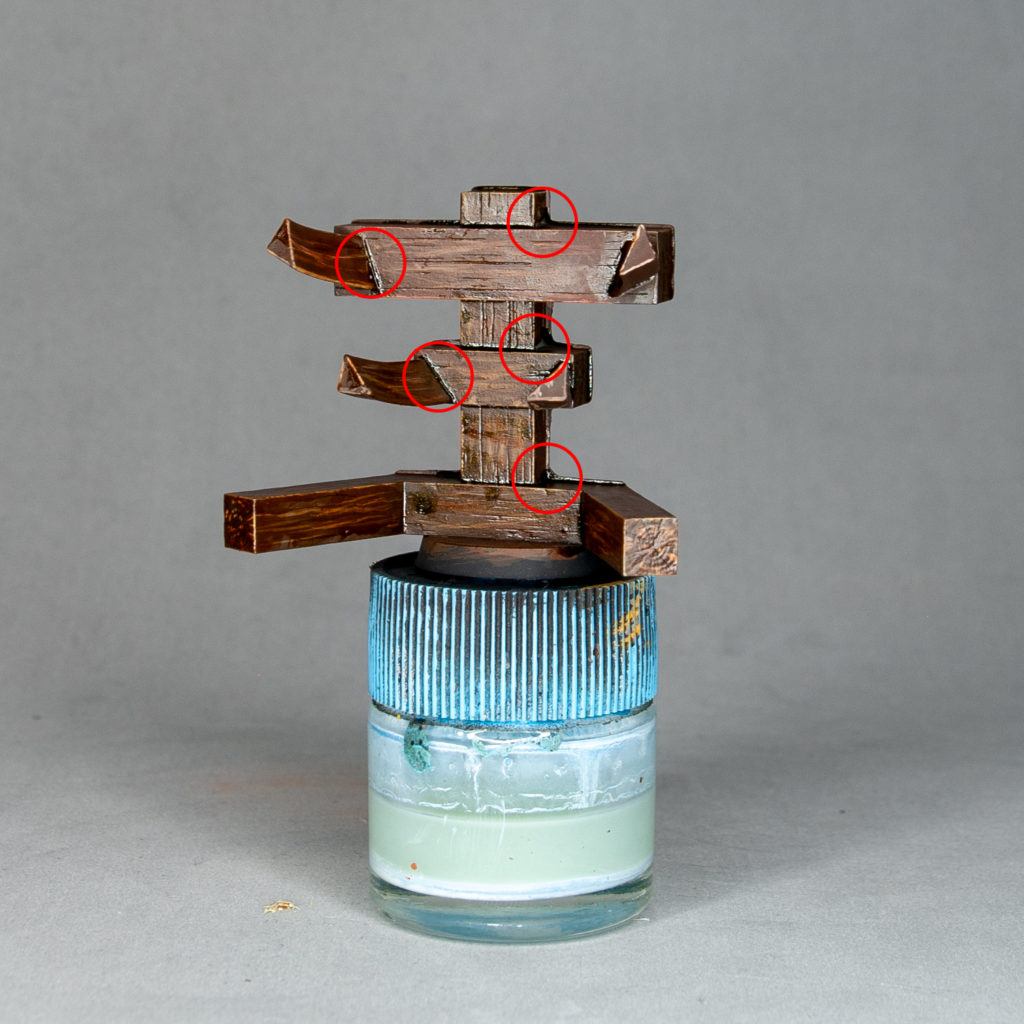
With Green and Wood ink, keeping a pretty green mix, I started placing deposits in the joints of the different wood pieces. Leaving some pooling here is interesting because it will generate noise and true texture that can be understood as grime/mold that some old wood tends to accumulate.
Surface glossiness will get worse, but don’t worry about it.

The process of using varnish for protection of the prop consists of first using a glossy varnish which will give a hard coat and then using a matt varnish over it to give the matte finish.
Marabu makes excelent varnishes and that’s my choice when going for protection on large surfaces.
For a very matt finish I use Ultra Matte Varnish from AK. This won’t offer any additional protection, but will give a much more matte finish than any varnish.
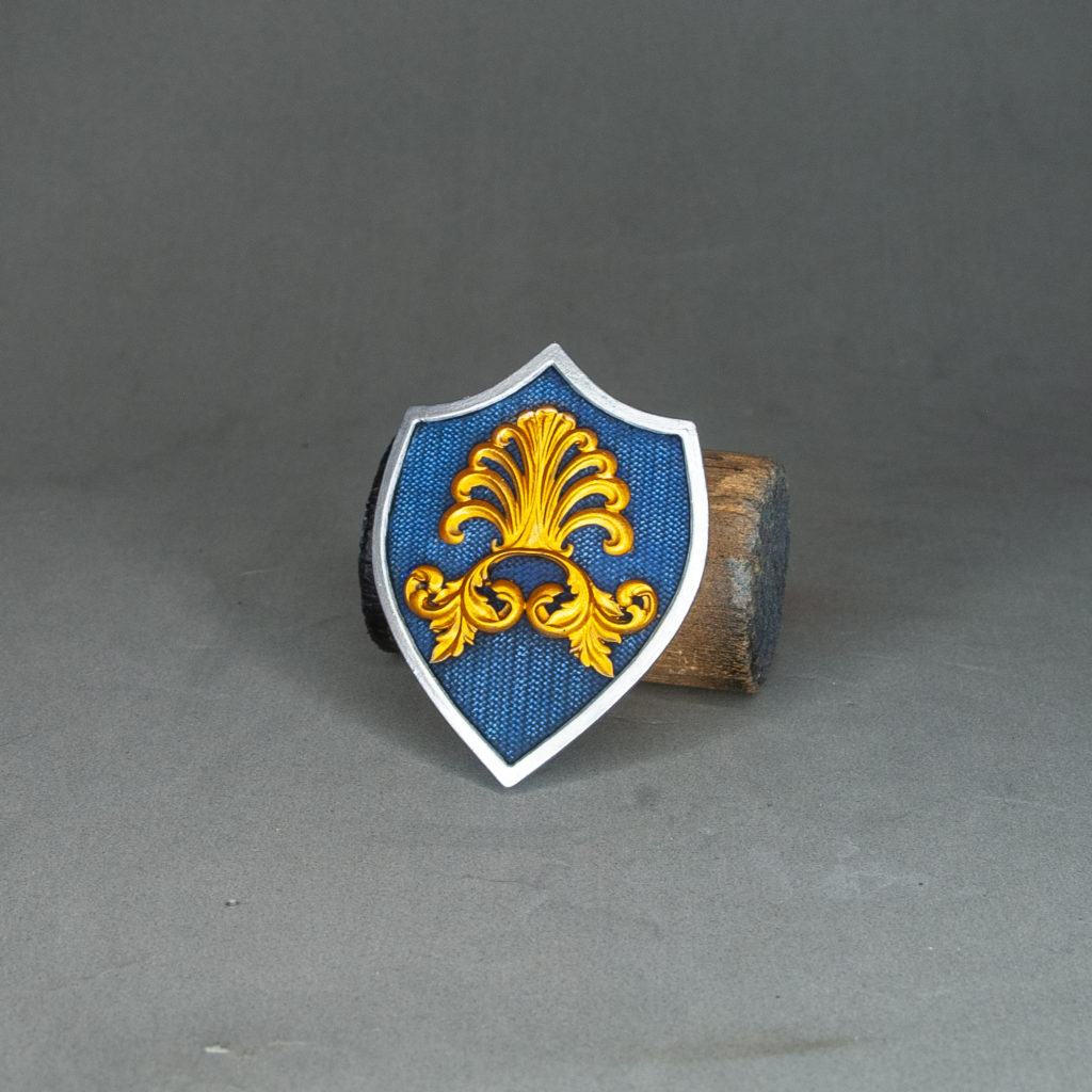
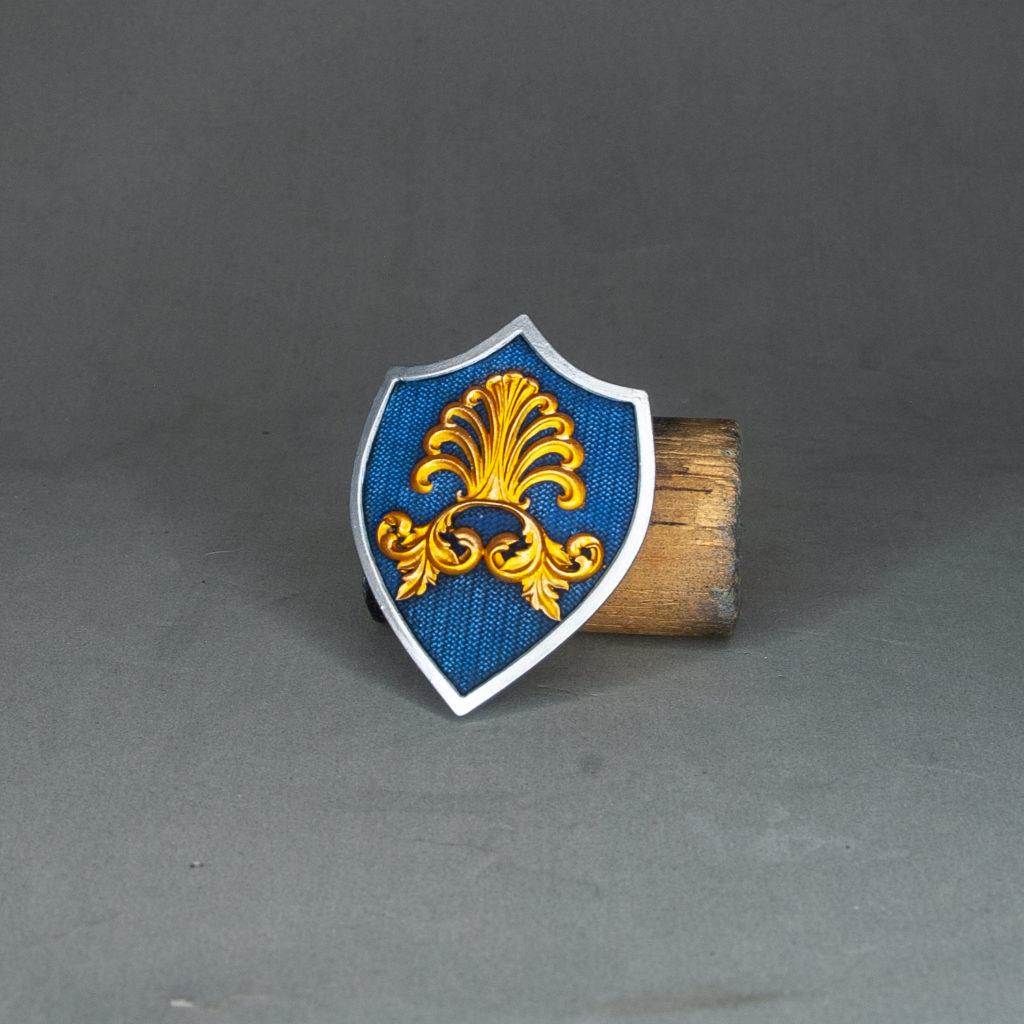
Finsihed piece with both parts varnished with the method mentioned above. I only used the Ultra Matte on the stand, as using a product so aggresive would kill the natural reflections of the metallics.